IGS Production
A multilingual site for a Warsaw video, audio and animation studio: a striking home page, their projects in galleries, and nothing to distract from the work.
- Role
- Design and development
- Sector
- Video production
- Type
- Client project
- Outcome
- 3 languages, 5 realisations
An established studio, a small audience
An established studio, a small audience
IGS Production have made films, animation and podcasts for brands and institutions since 2017. They came with a clear idea of how they wanted to look online, and needed a site that would take their work to more people.
The studio's work comes first
We drew several sample pages, merged the variants the client chose, and built the site from scratch: a minimal home page, projects in galleries, short cards for the team, and a contact page with a form and a map.
At launch
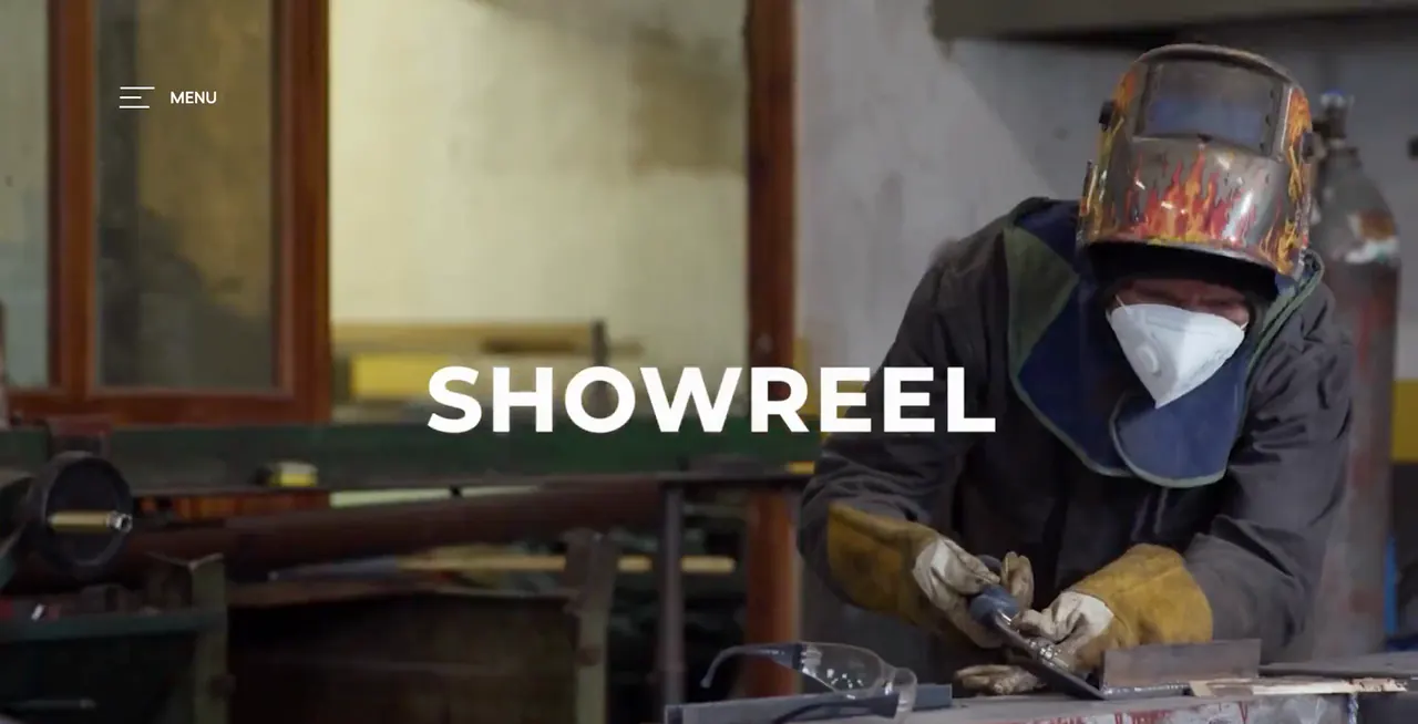
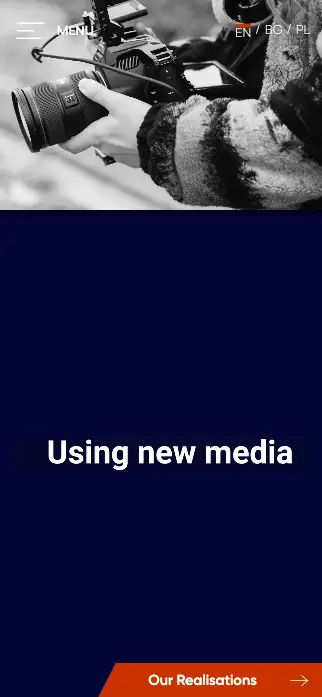
The IGS Production site at launch: the studio's showreel running full screen on a desktop, and the home page on a phone.
What the site has
Four pages in three languages, each with one job: say who the studio is and show what it has made.
- 01
Designed from scratch
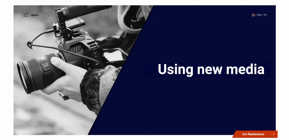
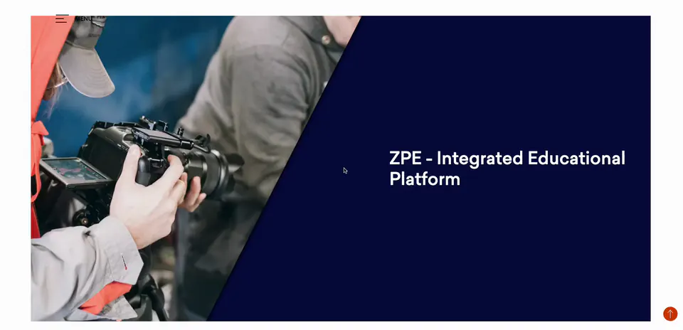
The client picked variants from several sample pages, and we brought them together into one style. On every page the photo and the navy panel split the screen on a diagonal, and everything you can click is orange.
- 02
Realisations and galleries
Each project has its own gallery, a short account of the work and a link to the result. Nothing on the page competes with the pictures.
- 03
Rethought for the phone
The diagonal layout was reworked for small screens rather than squeezed onto them. Most of the tuning time went here.
- 04
Accessibility
Readable by screen readers, usable from the keyboard, and every image has a text description.
- 05
Three languages
English, Bulgarian and Polish from the first day. A Swedish version has since joined them.
- 06
Ready for search and advertising
Titles, descriptions and sharing previews on every page, the site indexed in Google, and Google Analytics 4 and Meta tracking prepared in advance.
Early on we agreed with the client not to use WordPress, a ready-made theme or a site builder. A site written for the studio loads faster and looks exactly as it was designed. We can tune each of its pages on its own. The content changes rarely, so we did without an admin panel that would need maintaining.
Three pages, the way a visitor sees them
Recorded at launch.
Home page
The visitor sees one photograph, one animated headline and a single button to carry on with. The navy diagonal and the orange button set the tone for every other page.
Realisations
Each project opens on the same diagonal, followed by its gallery, what was made and for whom. On a phone you swipe through the gallery, and on a desktop you click through it.
Contact
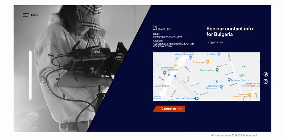
Address, phone and a map on one side of the diagonal, and a short form a click away.
Ten weeks, from the first sketch to launch
- In total
- 10 weeks
- Team
- A designer, two front-end developers and a project lead
Design
We showed sample pages, went through several rounds of comments and arrived at one shared design.
Weeks 1-3Build
We built the four pages, the galleries and the motion.
Weeks 4-7Phone and accessibility
We adapted the site for small screens, screen readers and keyboard use.
Weeks 8-9Languages and launch
We added the translations, set up the search basics and got the site indexed.
Week 10
The site in numbers
- languages at launch
- 3 languages at launch
- realisations, each with its own gallery
- 5 realisations, each with its own gallery
- accessibility on a phone, scored by Lighthouse
- 98/100 accessibility on a phone, scored by Lighthouse
- search readiness on a phone, scored by Lighthouse
- 100/100 search readiness on a phone, scored by Lighthouse
On 23 September 2026 we counted the realisations on the site as it is now and measured the scores with Lighthouse on a phone profile.
The brief and the result
| Measure | What they asked for | What they got |
|---|---|---|
| Their image | Look the way they see themselves | A design drawn from scratch around their brief |
| Portfolio | Show the work, not describe it | Five realisations, each in its own gallery |
| Audience | Reach a larger audience | Three languages from the first day |
| Accessibility | Usable by everyone, on any device | Accessibility scored 98 out of 100 on a phone |
Their image
- What they asked for
- Look the way they see themselves
- What they got
- A design drawn from scratch around their brief
Portfolio
- What they asked for
- Show the work, not describe it
- What they got
- Five realisations, each in its own gallery
Audience
- What they asked for
- Reach a larger audience
- What they got
- Three languages from the first day
Accessibility
- What they asked for
- Usable by everyone, on any device
- What they got
- Accessibility scored 98 out of 100 on a phone
Want a site that shows your work?
We make sites for studios, agencies and makers whose work is there to be watched, not read. Your best projects go at the centre of the site.
Get in touch